21-Week Race Challenge
Additional Resources
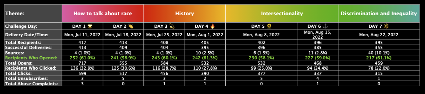
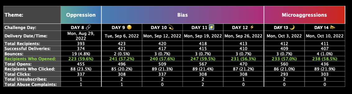
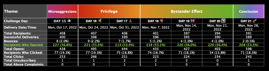
DATA
Participation By Day and Theme
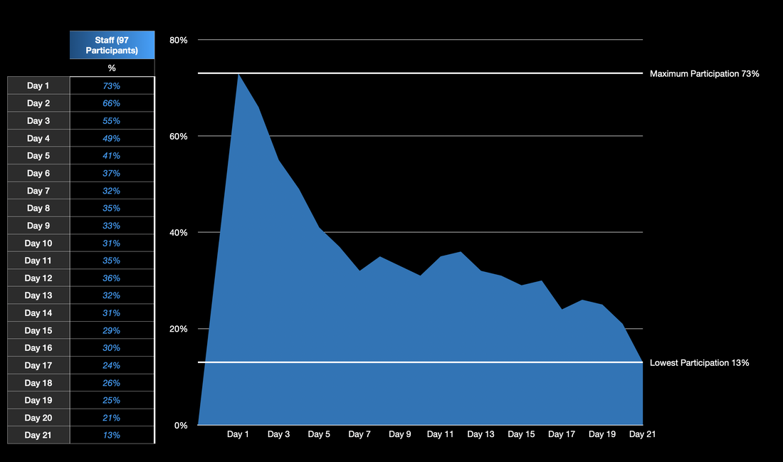
Participation Over Time
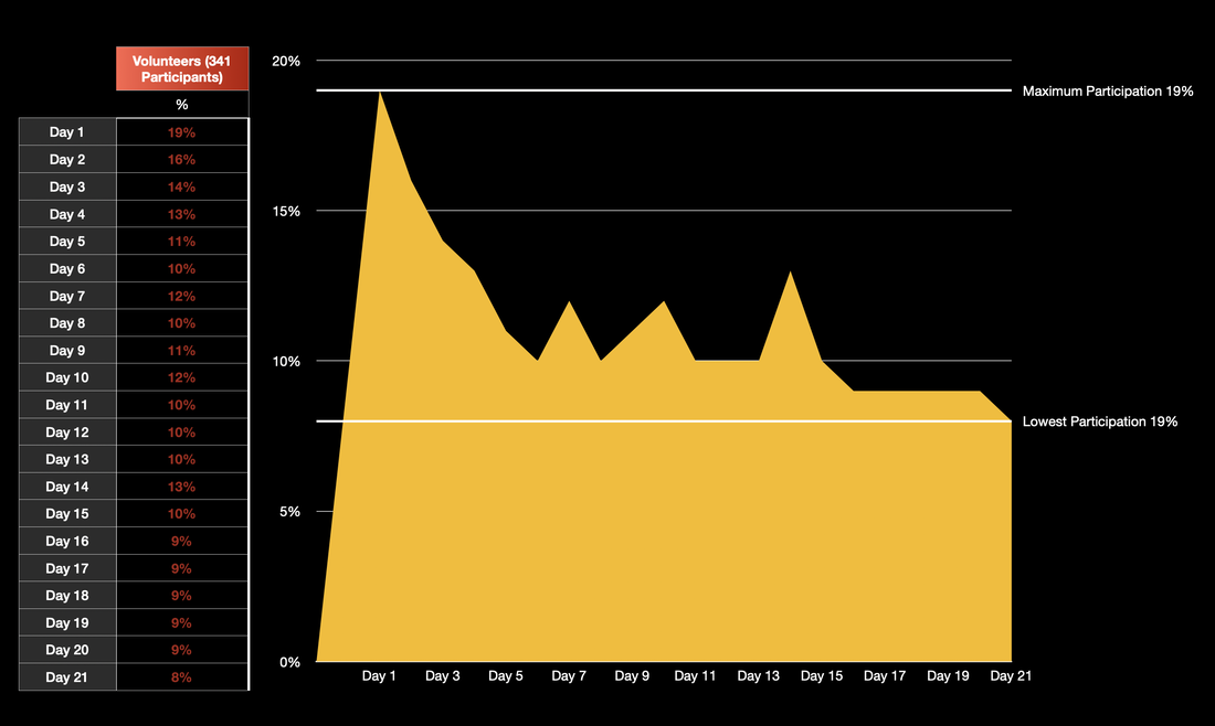
The Arvada Center had some great participation rates! I’m sure it might not seem like it for some, seeing numbers like 5-73% google form completion. First of all, let’s ignore the data for Day 21. In the intro video, I gave participants explicit permission to save both the PDF and the video for another time, due to their lengthy nature. Ya’ll get a pass for Day 21. It’s also important to keep in mind that this chart reflects the number of people who filled out the google form– a much higher percentage of folks read through the emails without filling out the form, and their reasons are their own. I am showcasing the data on the number of participants who completed the google form because that’s what the rest of the data in this packet is based on. This is also great data to show how many folks were told this training was “required”, but chose not to fully participate in one way or another. If you did not fully participate, I encourage you to speak to someone on the IDEA committee about your Why. Was 8-11 minutes a week too much of an ask for a busy schedule? Do you vehemently disagree with the training in general? Maybe you never got any of the emails. Please let someone know, so we can find ways to engage more with you and bring you along on our journey to make Arvada Center an even more safe and welcoming place for everyone.
Staff Participation Over Time
Volunteer Participation Over Time
Board Member Participation Over Time

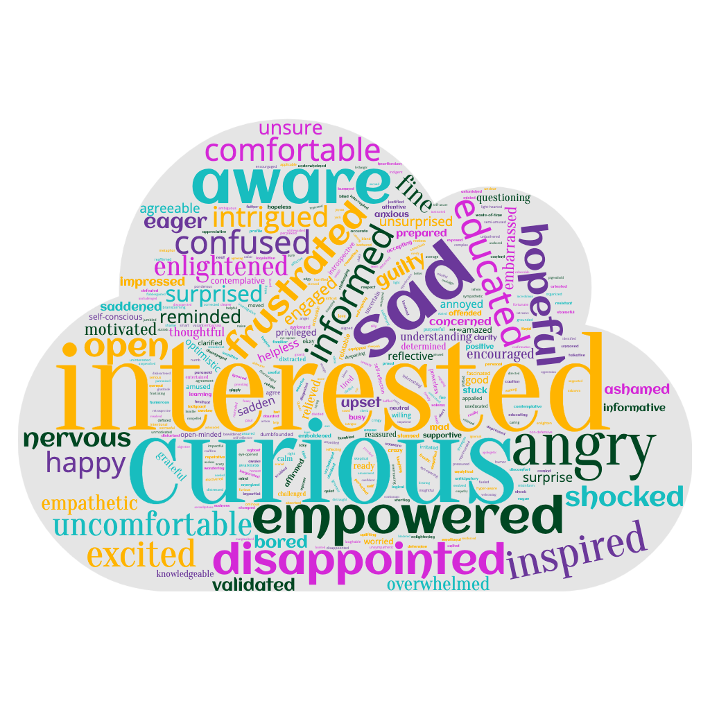
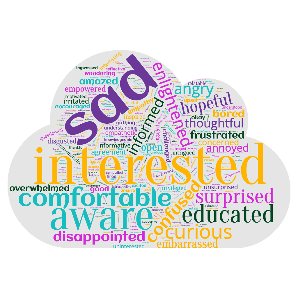
WORD CLOUDS
Word Clouds are a great way to visualize data given to us by language. Remember how ya’ll had to fill in “Three words to describe how you felt” on the google form every week? We turned those into a huge list, and counted up how many times each word was repeated. We put the list of words and how often they were repeated into a “Word cloud generator”, which then makes a picture like the ones below. The more times a word was repeated, the larger the word is represented in the word cloud. Words with fewer “votes”, if you will, appear smaller, while words people wrote down more frequently are larger.
Staff
Personally, I’m loving that the word interested is the largest word for all three of the clouds! We’ve got other words in here like nervous, uncomfortable, and shocked, which aren’t necessarily negative things. It’s okay to be uncomfortable when talking about racism– if no one was uncomfortable, we’d have solved for it already. Words like disappointed can mean a lot of you were disappointed in the training itself, disappointed in the systems that are disproportionately unfair to people of color, or something else. However, when combined with the context of long form answers that were provided, I can reassure you that the overwhelming majority were indeed “disappointed” by society at large.
Volunteers
One of the best reasons to show a Word Cloud of the volunteer responses separately, is that ya’ll don’t often get a chance to collaborate with each other on these subjects in person, as a group, unlike your staff counterparts. This is a great way to visualize sentiments on racism and the 21 Week Challenge that your fellow volunteers hold, and see which feelings are strongest on the subject. Three cheers for interested, empowered, and curious being the biggest words!
Board
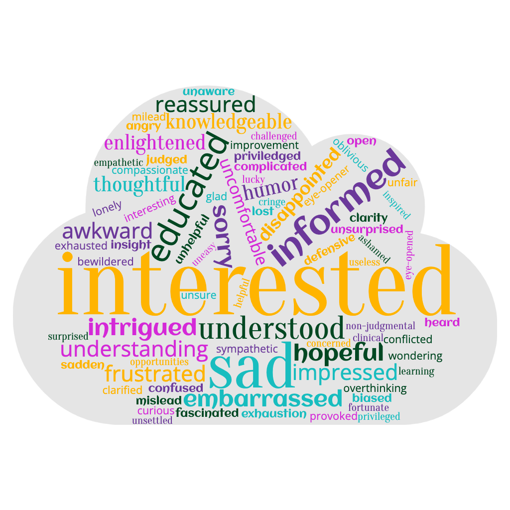
There aren’t nearly as many board members as there are staff and volunteers, so this cloud is a little less… cluttered. The most critical words in this cloud are sentiments like conflicted, provoked, and judged, as opposed to the other clouds that saw staff and volunteers noting things like waste-of-time, infantilizing, and this-is-stupid. This tells me that the board is, well, on board, for the bigger picture, and are more open to the processes however they appear, while staff and volunteers are more particular about the processes being chosen for them to participate in.